 站長資訊網
站長資訊網
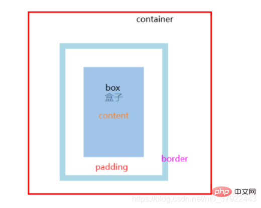
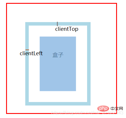
本篇文章給大家通過圖文方式講解JS盒子模型的基本屬性:clientWidth/Height、offsetWidth/Height、offsetTop/Left、scrollWidth/Height、scrollTop/Left,希望對需要的朋友有所幫助! 寫一個JS盒子 模型: clientWidth / clientHeight :盒子內部的寬高 clientTop / clientLeft :左邊框和上邊框的寬度 offsetWidth / offsetHeight :盒子可見區域的寬高 offsetParent:獲取它的父參照物(不一定是父元素) offsetTop / offsetLeft:距離其父參照物的上/左偏移(當前元素的外邊框到父參照物元素的里邊框) scrollWidth / scrollHeight :可視區內部的真實寬高 scrollTop / scrollLeft:豎向/橫向滾動條卷曲的高度/寬度
<style> .container { width: 300px; height: 300px; border: 3px solid red; margin: 50px; position: relative; } .box { padding: 30px; width: 100px; height: 150px; border: 10px solid lightblue; position: absolute; top: 50px; left: 50px; font-size: 15px; line-height: 100px; text-align: center; overflow: auto; } </style> <body> <div class="container"> <div class="box">盒子</div> </div> </body>
盒子的屬性:client
(1) clientWidth: 內容width + 左右padding
(2) clientHeight: 內容height + 上下padding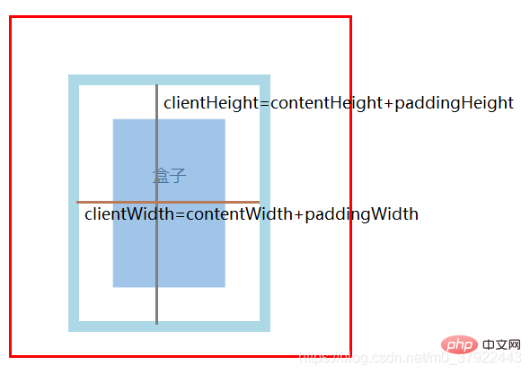
offset
(1) offsetWidth: clientWidth+ 左右border
(2) offsetHeight: clientHeight+ 上下border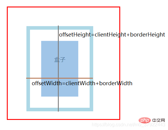
父參照物的查找:
(1) 在同一個平面中,最外層元素是所有后代元素的父參照物;
(2) 而基于position:absolute/relative/fixed會讓元素脫離文檔流,成為一個新的平面,從而改變元素的父參照物;
(3) body的父參照物為null。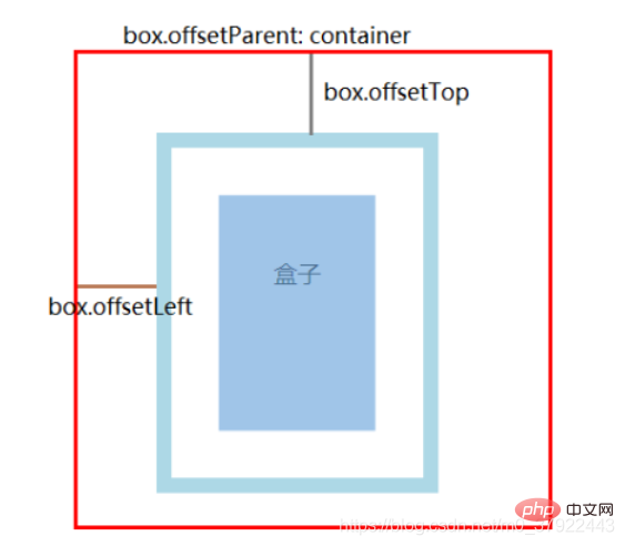
scroll
(1) 沒有內容溢出時: scrollWidth/Height = clientWidth/Height
(2) 有溢出的話不一樣,結果約等于盒子真實內容的寬高:上下padding+真實內容的寬高;
(3) 只要出現溢出的情況,overflow的值,也會一定程度地改變scroll的結果。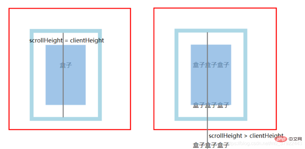
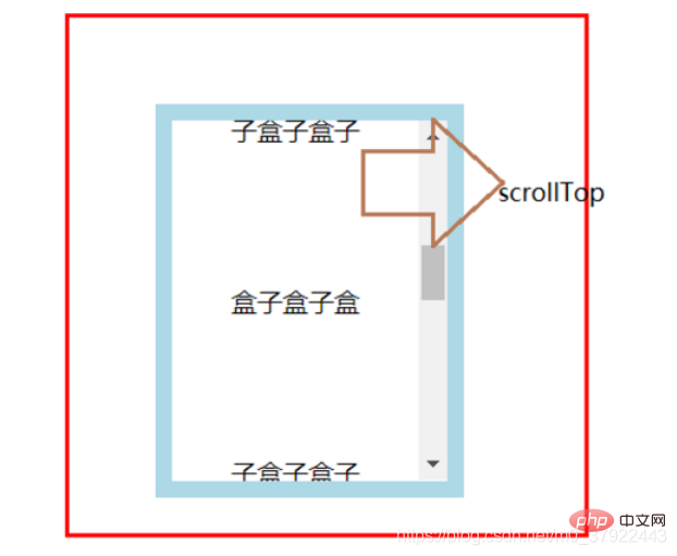
注:上面的屬性里,只有scrollLeft和scrollTop可以設置值,其他屬性都是只讀
站長資訊網
最全最豐富的資訊網站
最全最豐富的資訊網站
